United by Design, Driven by Digital
Industry
Advertising
Client
Primacy, Mediate.ly, Zen Source
Role & Responsibilities
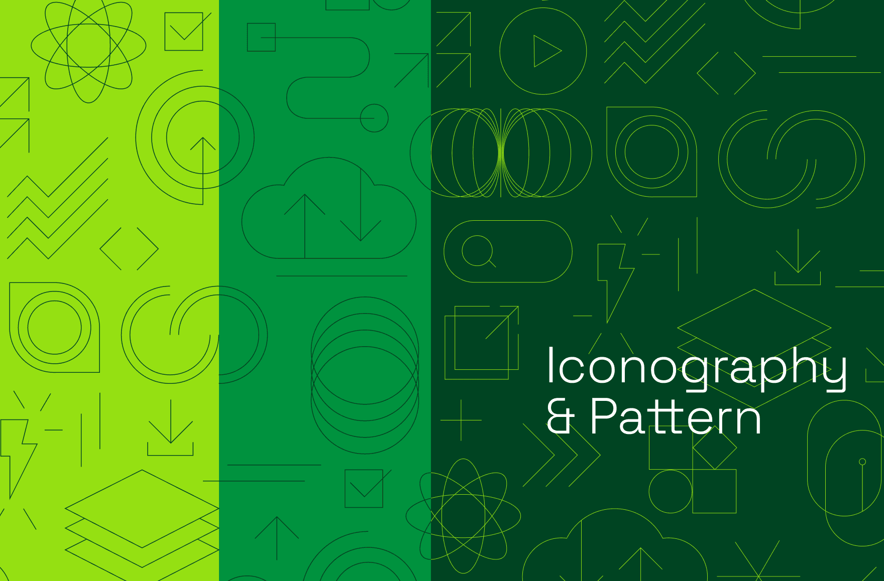
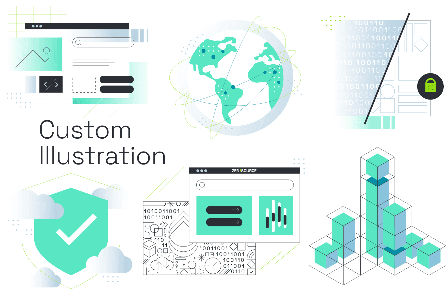
Creative Concept Brand Identity Art Direction Website Design Employee Digital Resources Social Media Templates Icon libary & Illustration Conference Booth & Collateral Brand Sizzle Reel Stationery
Collaborators
Kieran McCabe - Creative Direction Erin Kelly - Art Direction Theresa Gaffney - Copy
The Mission
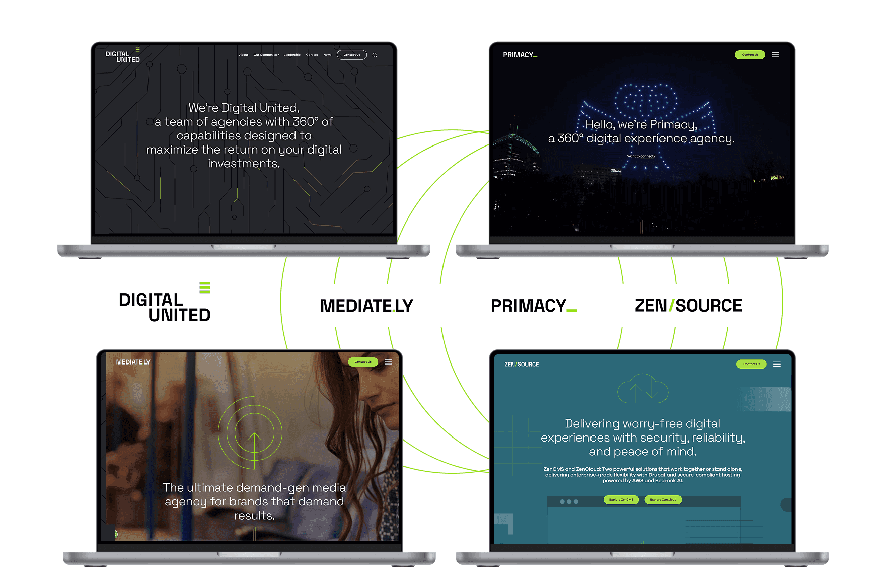
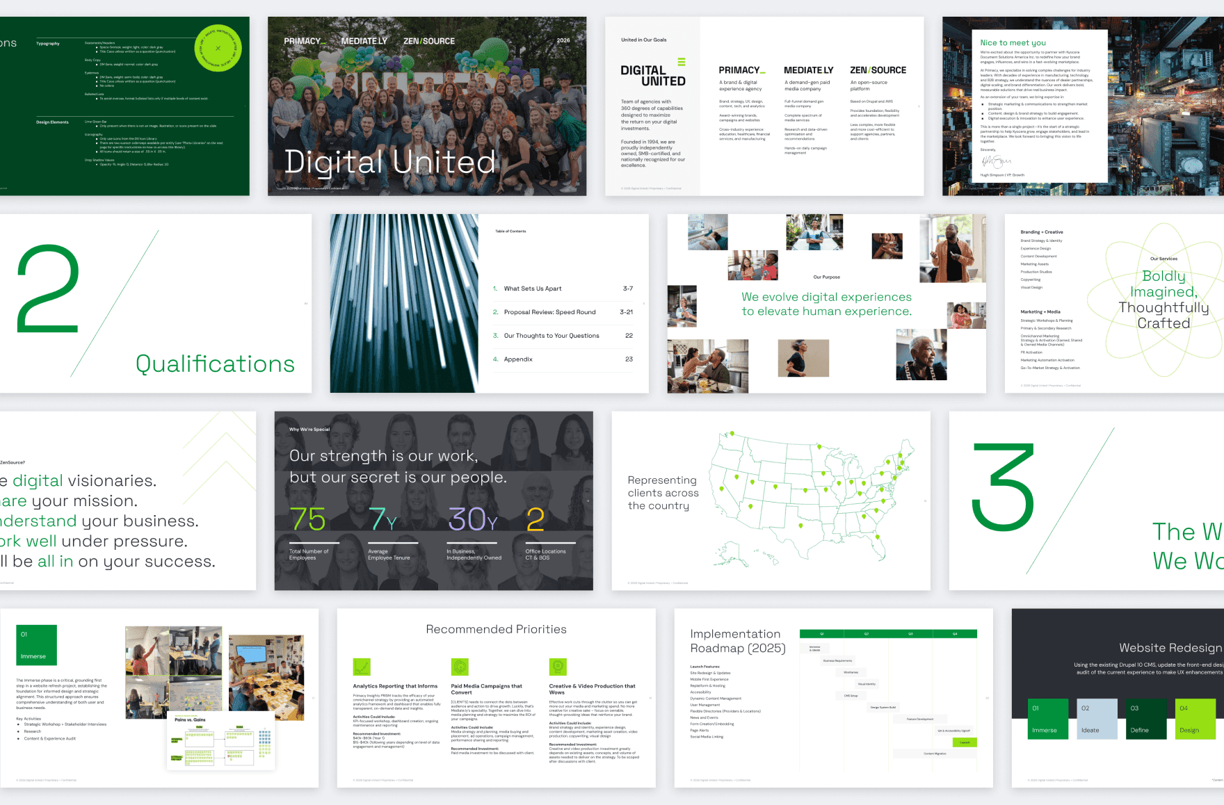
As Primacy evolved into a collective of specialized agencies, the brand needed more than a new name. It needed a unified identity. The challenge was to transform Primacy, Mediately, and Zen Source into Digital United while preserving the equity and expertise of each brand. We created four interconnected identity systems centered on the purpose, "We evolve digital experiences to elevate the human experience," designed to scale across digital, print, social, internal tools, and launch communications. More than a rebrand, it was a flexible system that balanced digital innovation with a human-centered approach.
The Hook
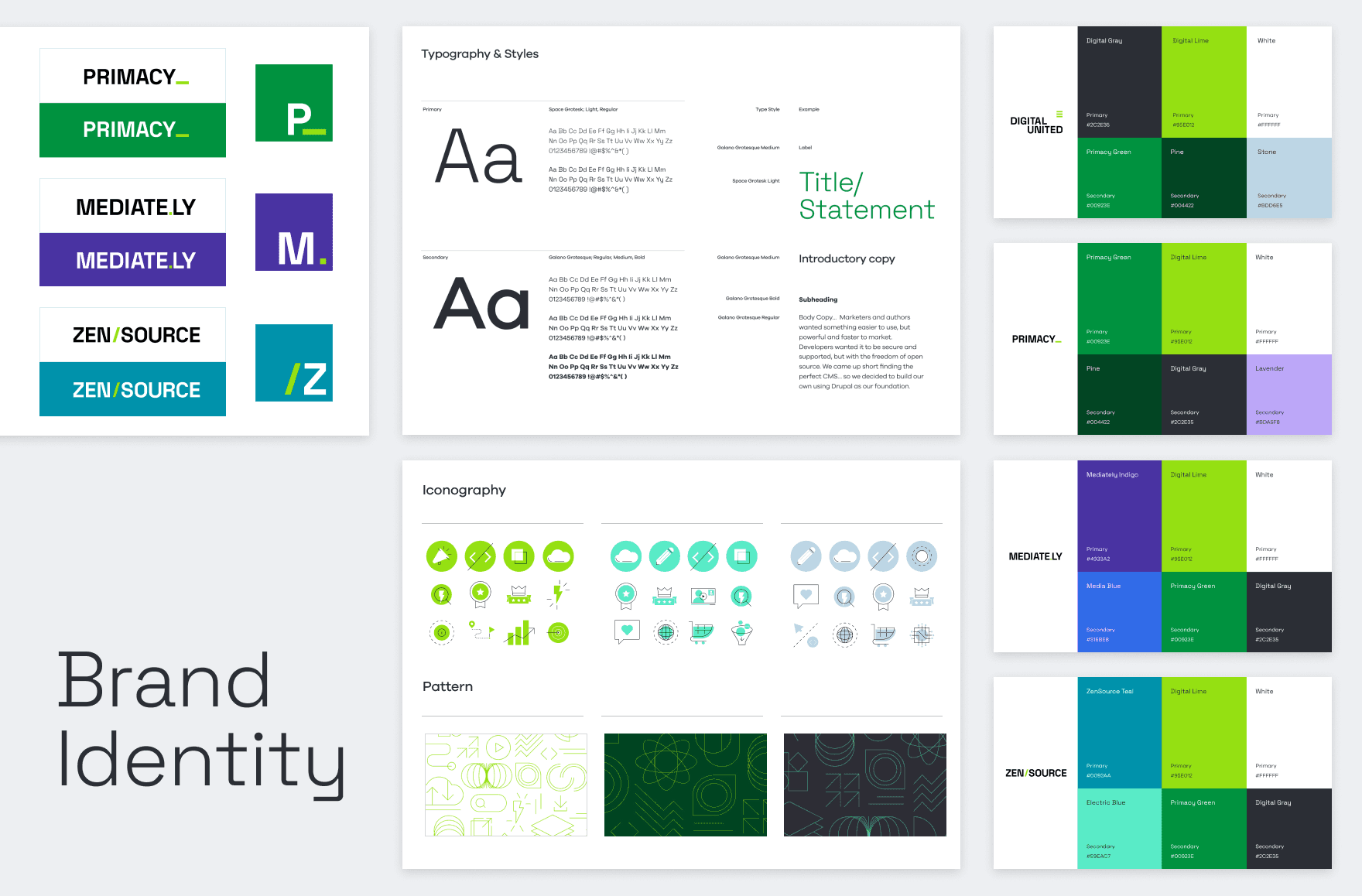
The identity system was built around a simple idea: each agency would be represented by a digital symbol that reflected its purpose while signaling membership in a larger ecosystem. Primacy adopted the underscore (_), a connector that represents the intersection of brand, strategy, UX, design, and digital storytelling. Mediately uses the period (.), symbolizing precision and measurable outcomes. Zen Source is defined by the forward slash (/), a nod to code and open-source flexibility. Uniting them all, Digital United is represented by the universal hamburger menu icon, a navigational container that brings independent entities into one cohesive system.

The Feeling
/
/
/
/
Innovative Human-Centered Systematic Modern
The Finish Line
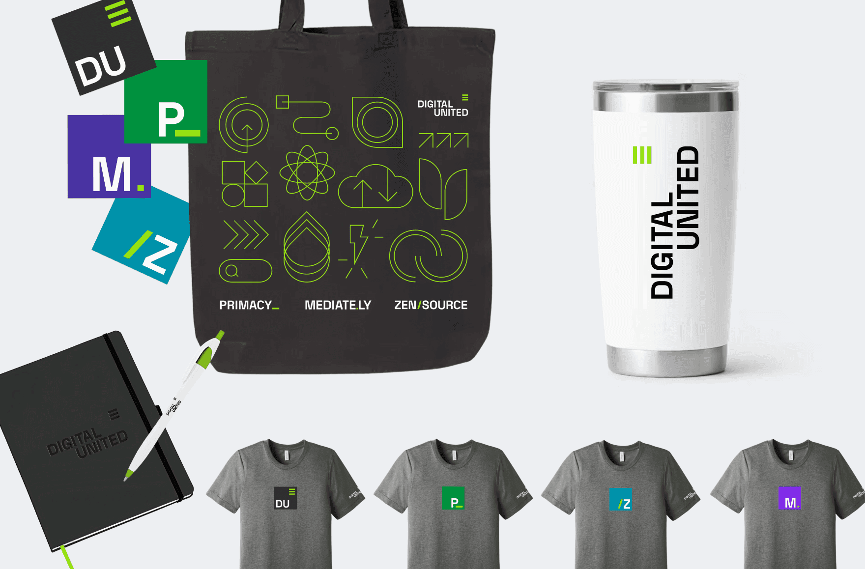
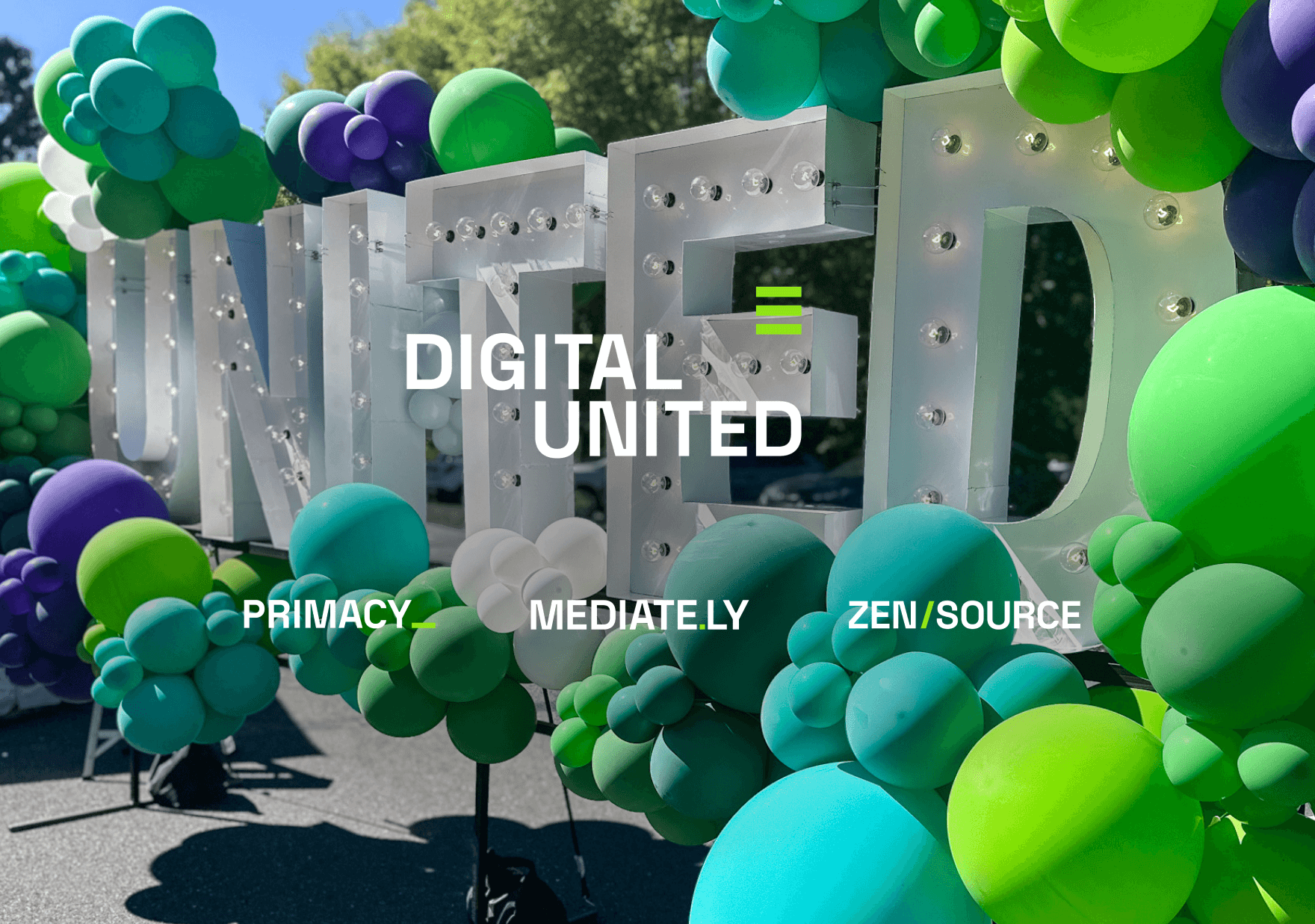
The result is a scalable brand ecosystem spanning logos, visual identity, websites, social, stationery, email signatures, Zoom backgrounds, employee swag, and a launch sizzle video. Each entity has its own distinct personality while seamlessly connecting back to the Digital United brand. More than a visual refresh, this rebrand positions Digital United as a unified force built on specialization. It demonstrates how four focused entities can work independently and collaboratively, evolving digital experiences that ultimately elevate the human ones that matter most.